Build your own dashboard
A dashboard looks like a design problem. It is really four quiet engineering decisions, and your agent will make all four before you have finished describing what you want to see.
Built in parts · Part 1 is live · part of Build your own tools, more coming
Your numbers already exist. They are just scattered: a little in your payment tool, a little in a spreadsheet, a little in the app’s own database. A dashboard is the simple act of deciding to put the few that matter in one place you can glance at.
This is the most satisfying first thing to build, because the itch is so concrete. You are tired of logging into four tools to answer one question. So you say to your agent, “build me a dashboard of my key numbers,” and it cheerfully does, and it works on your laptop that afternoon. That is real, and you should feel good about it.
But “build me a dashboard” is not one instruction. Underneath it are four separate decisions about where the numbers come from, where they rest, how often they refresh, and what you actually show. Your agent will settle all four in the first minute, silently, usually by reaching for whatever is quickest to type. Most of the time that is fine for a tool only you use. The point of this page is to let you see the four decisions clearly enough to overrule the one or two that matter for what you are building.
Anyone who wants their own numbers in one view and is willing to direct an agent to build it, whether or not you write the code yourself.
The four decisions a dashboard is made of, a worked build from scratch, and a sense of what changes the day you share it.
How to read this. Everything below starts as a one-line verdict you can skim in a couple of minutes. Open only the parts you care about for the depth. Dotted terms like give you a plain definition on hover or tap.
First, what could it even look like?
#Before any engineering, it helps to see what you are actually asking for. “A dashboard” is really one of a few shapes. Here are the common ones. The one in your head is probably on this page.
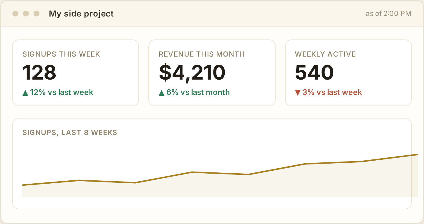
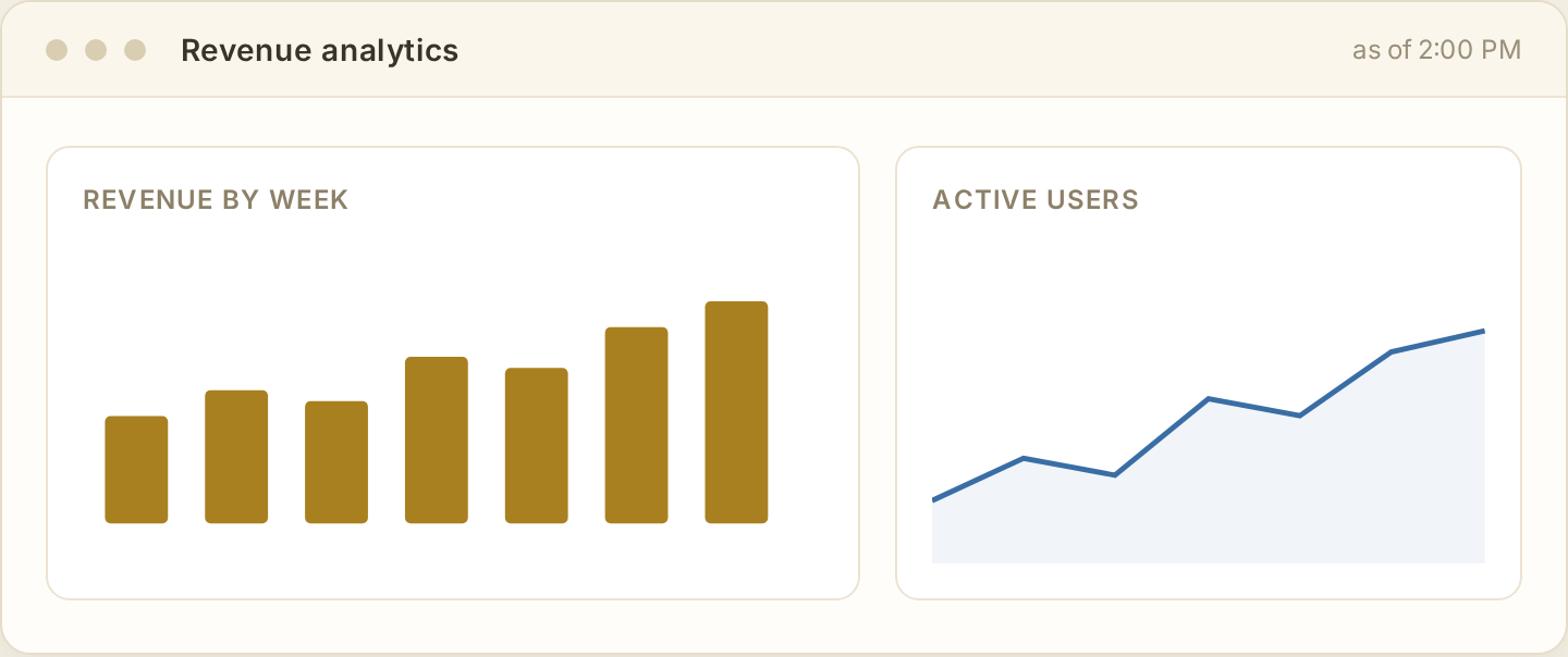
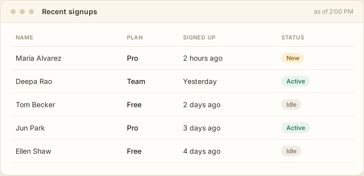
Most real dashboards are a mix: a couple of scoreboard numbers up top, one chart, a list underneath. Knowing which shapes you want is the first thing to hand your agent, because “a dashboard” means all three of these and it will guess which you meant.
Where does it live, and how do you get it?
#This is the decision people cannot see coming, because in your head “just show it to me” feels like one thing. It is not. These options look equally simple and are wildly different amounts of work.
Viewing it on your laptop, opening a saved page, or generating a are all easy, because nothing has to keep running: you ask, it makes the thing, you look at it. Putting it on a server so there is a is a step up, because now something has to stay up around the clock.
And “just email it to me every Monday” is quietly the hardest one on the row. It needs all of that plus three more moving parts: something that wakes up on a schedule, something that turns the live page into an image or PDF, and an email system that actually gets delivered instead of landing in spam. It sounds like the smallest ask. It is the biggest. Knowing that before you ask is exactly the kind of thing this page is for.
How the numbers get in
#The numbers live in other tools. Getting them into your dashboard happens one of two ways, and the difference is bigger than it looks from the outside.
Pull is you reaching out: your dashboard asks each source “anything new?” on a schedule and copies back the answer. It is simple, you control the timing, and the only cost is that the numbers are as fresh as your last check. Push is the reverse: the source notifies you the moment something changes, usually through a . It is as live as it gets, and it is more moving parts to set up and keep working. For a dashboard you glance at, pull wins almost every time.
Where you pull from is its own small ladder. The easiest source is a you drop in by hand. The most common is an , the doorway most tools open for code. And increasingly there is the , a doorway designed for agents, which can make the whole connection dramatically less work when a tool offers one.
▶Get your agent to choose the mechanism on purposecopy for your agentMake it name how it will reach each source, and justify pull over push unless live truly matters.
An agent will often default to calling sources live on every page load, which is neither pull-on-a-schedule nor push, and tends to be the fragile worst of both. Make the choice explicit.
How it's actually built
Those are the shapes. Underneath, a dashboard is a small pipeline: the numbers flow left to right through four stages, and each stage is one decision you get to make on purpose. Tap a stage to jump to it.
Pull the numbers in, keep them, refresh them, show them. Build left to right, and most of the work is deciding how little you need at each stage.
The shape of a dashboard
#Hold this one picture and the rest follows: a dashboard pulls numbers from somewhere, keeps a copy, refreshes that copy on some rhythm, and draws the result on a screen. Source, store, refresh, display. Every dashboard ever built is some version of those four, and the whole craft is noticing how little you actually need of each. A tool just for you can skip corners that a tool for a hundred people cannot. Knowing which corner you are cutting, and on purpose, is the difference between a quick win and a thing that quietly lies to you.
The four decisions
#Verdict first. Open one for what the decision really is, the lazy default your agent will reach for, and the question that forces a better choice.
▶Source · where the numbers come fromstart hereThe decision here is not the mechanism, it is the count: how many sources, and how painful is the worst one?
Your numbers live somewhere already: inside a payment tool like Stripe, inside your app’s own database, inside a spreadsheet you keep by hand. Each of those is a source. How you reach each one, and pull versus push, is covered just above in how the numbers get in. The decision here is the one people skip: how many sources does this really need, and how painful is the worst of them?
One source is a weekend. The honest difficulty of most dashboards is “I need three different places and they all speak differently,” and knowing that before you start is what keeps a quick win from turning into a slog.
▶Store · where the numbers restthe quiet decisionFor a personal dashboard, keep a small local copy rather than hitting every source live. A file or SQLite is almost always enough.
Here is the decision most people do not realize they are making. Do you fetch the numbers fresh from the source every single time, or do you pull them once, keep a copy, and read from the copy? Keeping a copy is a , and for a dashboard it is almost always the right move: your page loads instantly, you stop hammering the source, and the dashboard still works for a minute if a source hiccups.
That copy has to live somewhere, which is its own small decision with real trade-offs. For a personal dashboard it is genuinely tiny: a flat file or an on-device database is plenty. You only need more the day the dashboard is shared and busy. That whole decision has its own page.
▶Refresh · how the numbers stay currentwhere people over-buildYou almost never need real-time. A scheduled pull every few minutes or hours into your local copy is simpler and good enough.
Now that you keep a copy, you have to decide how often to refresh it. The instinct is “live, always up to the second.” You rarely need that, and chasing it is where personal dashboards turn into a tangle. The simple pattern is : a small job wakes up on a schedule, pulls fresh numbers from each source into your local copy, and goes back to sleep. The dashboard just reads the copy. The schedule itself is usually a job.
The question that sets the whole design is not technical, it is about you: how stale is too stale? For most personal dashboards the true answer is “an hour old is completely fine,” and that answer lets you build the simplest possible version.
Decide how fresh you actually need the numbers to be. That one answer quietly determines how hard the whole thing is to build.
▶Display · what you actually showrestraint winsShow the two or three numbers that would change what you do this week. A wall of charts is the most common way a dashboard becomes useless.
This is the fun part and the easiest to get wrong. You already saw the three shapes at the top of the page: the scoreboard, the charts, the list. Most good dashboards are a small mix of them, and the mistake is always more. An agent will happily give you twelve charts, and twelve charts is noise you will stop looking at inside a week. A dashboard earns its keep when it answers one question at a glance: is anything different, and do I need to act? That usually means a few big numbers, maybe one trend line, and almost nothing else.
The discipline is to pick the handful of numbers that would actually change a decision, and cut the rest, however interesting they look. A number you will never act on is decoration.
Go deeper: the ideas underneath
#Three concepts the decisions above lean on, in plain terms, each with a prompt that makes your agent apply it to your build.
▶Fresh enough, not fresh alwaysconceptA cached number is always a little out of date. The skill is deciding how out of date is acceptable.
The moment you keep a copy of a number, that copy starts aging. The source has moved on; your dashboard has not caught up yet. This is called staleness, and it is not a bug to eliminate, it is a dial to set. A dashboard refreshed every hour is up to an hour stale, and for almost everything personal that is completely fine. Trying to drive staleness to zero is exactly the over-engineering that turns a weekend build into a month.
The one place it bites: showing a stale number next to a timestamp that implies it is live. If you show “live revenue: $4,210” and it is actually an hour old, you have not saved time, you have built a small liar. Label the freshness honestly (“as of 2pm”) and the problem disappears.
▶Pull on a schedule, pull on demand, or be pushedreferenceThree ways numbers get fresh. For a personal dashboard, a scheduled pull is almost always the right one.
There are really only three ways your copy gets updated. You pull on a schedule (a job refreshes it every so often, whether or not anyone is looking). You pull on demand (you refresh only when the page is actually opened, which saves work but makes the first load slow). Or you are pushed to (the source tells you the instant something changes, usually through a ). Push is the most “live” and the most fiddly to set up. For a dashboard you glance at, scheduled pulling wins on simplicity almost every time.
▶A dashboard lies by defaultconceptA single summary number hides as much as it shows. Know what each number is quietly averaging away.
Every number on a dashboard is a summary, and every summary throws information away on purpose. “Average response time: 1.2s” can look healthy while a tenth of your users sit at ten seconds, because the average buried them. “Revenue is up” can hide that one big customer carried the month and everyone else shrank. This is not dishonesty, it is what summarizing is, but a dashboard presents summaries with such confidence that it is easy to forget.
The habit worth building: for each headline number, ask what it is hiding. Often the fix is to show the shape, not just the summary (a distribution instead of an average, a breakdown instead of a total). You do not need all of that on a personal dashboard, but you should know which simplifications you accepted.
Worked build: a dashboard for your own side project
#The four decisions only click once you run them on something real. Here is the reasoning out loud for a dashboard you would actually want: the handful of numbers for a side project you run. Watch how each decision collapses toward the simplest option.
▶Build it end to endwalkthroughTwo sources, a tiny SQLite copy, an hourly pull, three numbers on a page. It runs on your laptop or a five-dollar box.
Say you run a small paid app and you are tired of opening Stripe in one tab and your app’s admin in another just to see how the week is going. You want one page: signups this week, revenue this month, and how many people actually came back.
Source. Two places have what you need. Stripe has an for the revenue, and your app already has its own database with the signups and the activity. So, two sources, both reachable in code. Your agent’s first instinct will be to call both live on every page load. Note it, and overrule it in the next step.
Store. You do not want to hit Stripe every time you glance at the page, so you keep a small local . How small? Three numbers and a little history. This is the storage decision from the storage page, and here it collapses almost instantly: an on-device SQLite file is more than enough, no server, nothing to run. A flat file would even do, but SQLite costs nothing extra and makes the little bit of history easy to keep.
Refresh. How fresh do these numbers need to be? Honestly, an hour old is fine, you are not trading stocks, you are checking in. So a small job wakes up every hour, pulls from Stripe and your app database into the SQLite copy, and sleeps. The page just reads the copy, so it loads instantly and still works if Stripe is briefly down.
Display. The temptation is a grid of charts. Resist it. Three big numbers (signups this week, revenue this month, weekly active) and one small trend line underneath is the whole thing. Each of those three would actually change what you do this week; nothing else earns its place yet. Label them “as of 2pm” so you are never fooled into thinking they are live.
Add it up and the build is small on purpose: an hourly script, one SQLite file, one plain page, running on the laptop you already have or a cheap always-on box if you want to see it from your phone. No server to speak of, no real-time anything, and every corner you cut you cut knowingly.
When your dashboard becomes a product
#Everything above assumed one user: you. The day you show it to someone and they say “can I have my own login,” you have stepped from a personal tool onto a different rung, and a cluster of new decisions switches on at once. You do not need them for yourself. You need all of them the moment the data is other people’s.
Here is the honest version of that jump. Each of these is a page of its own eventually; for now, the point is to recognize that they appear together, and why.
▶Who are you? (authentication)new on this rungThe moment more than one person logs in, the app has to prove who each visitor is. That is a real subsystem, not a checkbox.
A personal dashboard never asked who you were, because the answer was always “me, on my laptop.” Add a second person and the app suddenly needs : a trustworthy way to prove each visitor is who they claim. This is the single most common thing people underestimate and the most dangerous to improvise. The right move on this rung is almost always to let a dedicated service handle logins rather than rolling your own.
▶What are you allowed to see? (authorization)new on this rungLogging in is only half of it. Now the app must make sure each person sees only their own numbers, not everyone's.
Knowing who someone is () is different from deciding what they may see (). The instant your dashboard holds more than one person’s data, every single query has to be scoped to the right person, or someone will eventually load the page and see numbers that are not theirs. This is the most common serious bug in shared apps, and an agent will not add the scoping unless you make it a rule.
▶It is their data nownew on this rungOther people's data turns the storage decision serious: real backups, a tested restore, and care about what you even collect.
When the only data at risk was yours, a dropped database was a bad afternoon. When it is customers’ data, the same loss is an incident you have to answer for, and a leak of it can be a legal one. This is exactly the far end of the storage page: recovery stops being optional (a copy you have never restored is not a backup), and what you choose to collect in the first place starts to matter, because the safest data to lose is the data you never stored.
▶It has to be upnew on this rungA tool for you can be down while you sleep. A tool others depend on cannot, and that single expectation reshapes where and how it runs.
Your personal dashboard could crash overnight and you would fix it with coffee. Once other people open it during their workday, “it is down” becomes their problem and your reputation. You do not need heroic uptime on day one, but you do need to decide, on purpose, where it runs so it stays up without you watching, and how you find out when it does not. That is the beginning of the operations half of software, and it is a real rung, not a footnote.
None of this means you should build the product version first. It means the opposite: build the personal one, enjoy it, and recognize the exact moment, the first shared login, when these decisions switch from “skip it” to “all of them, now.” That recognition is the whole skill. The rest is asking the right question at each one.
Hand this to your agent before it builds your dashboard
Before you build this dashboard, decide out loud, for THIS project:
  1. Source  - every place a number comes from, and how we reach each (API, DB, file, manual).
  2. Store   - hit sources live, or keep a local copy? Where does the copy live? Prefer simplest.
  3. Refresh - how stale is acceptable? Simplest refresh that meets it (scheduled pull beats real-time).
  4. Display - the 2-3 numbers that change a decision this week; cut the rest; label freshness honestly.
Then build the SMALLEST version that satisfies all four, and name every corner you cut.
If this will ever have more than one user, flag it: logins, per-user data scoping, real backups,
and uptime all become required at once.